Graphs and instruments are great reporting tools that can be utilized to manage and visualize the data that that is stored within the eMaint system. In order to create graphs and instruments effectively, there is a level of importance in knowing how to set up the reports properly so that the data can appear appropriately as a graph or instrument.
For comprehensive documentation on how to create new reports in eMaint X4, search CreatingNewReports within the Search box on the eMaint Community Knowledge Base.
Elements that are needed in order to create a Graph or Instrument:
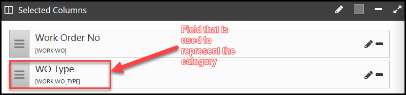
Category Field - X Axis - Selected field should be descriptive as to show what the value on the graph represents.
Values Field - Y Axis - Selected field should include a function. When creating a Graph or Instrument the field options will only be those with which functions are associated.
CreatingaGraph
When building a report that will ultimately be viewed as a graph, there are a few requirements that need to be satisfied in order to be able to successfully select your graph properties:
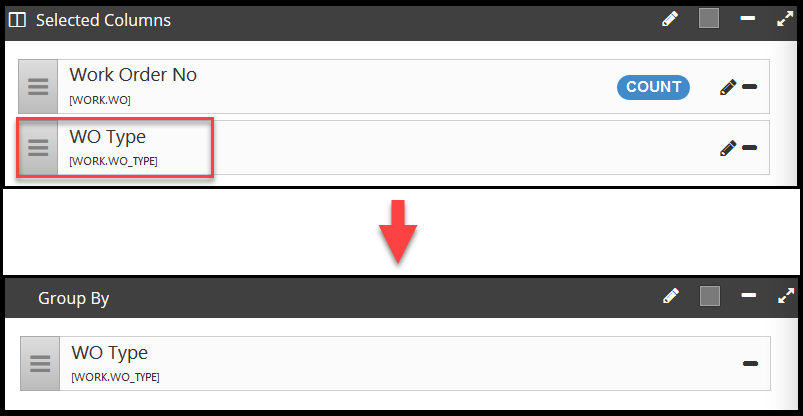
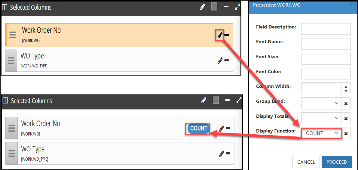
A function needs to be placed on a selected field by going to the properties and selecting the appropriate function. In the example below, we are counting the key field or unique value that will give us a count of Open Work Orders by Type (Work Order Number)

Utilize the “Group By” feature in order to group the category together. This is the field that will appear as the category on the X Axis.
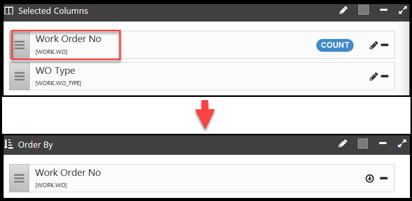
Sort by the field that has the function tied to it. This will allow organization of what numerical value is appearing on the “Y” Axis
Once these requirements are satisfied, the Graph Properties can be selected
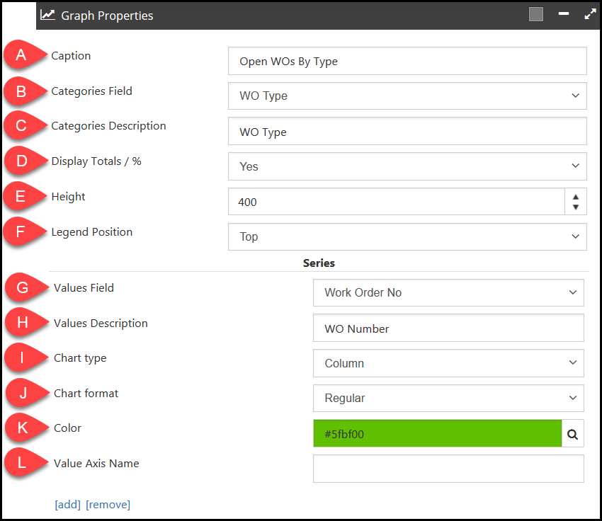
A - Caption - Caption or title of the graph, oftentimes the same or similar to the report name
B - Categories Field - Grouped by records described, describing each record type of y
C - Categories Description - Descriptive term to illustrate the categories field (can be the same as the field name)
D - Display Totals / % - Logical (Yes/No) field, giving the option to display a total or percentage
E - Height - Controls the default height of the window displaying the report
F - Legend Position - Controls the position of the legend, which shows what the values field represents. Options are Top, Bottom, Left, and Right.
G - Values Field - The field that includes a function to indicate a numerical value
H - Values Description - Descriptive term to illustrate the values field (can be the same as the field name)
I - Chart type - Controls what type of graph prints. Options are Column, Bar, Line, Area, and Pie.
J - Chart format - Enables selection of what style chart. All of these selections aside from “Regular” require additional steps. Options are Regular, Stacked, Stacked 100%, and Pareto.
K - Color - Select what color the graph will be when it prints
L - Value Axis Name - Allows to reference the name an additional value axis (only when/if created in the “Value Axis” section below the “Series” section), which can be used if you wish to represent two different types of values on the same graph. With that said, this field should be left blank if the “Value Axis” section is also blank.
AdditionalInformation- The bottom of the “Series” section has an Add or Remove option, which allows for an addition of another “Y” Axis which is most commonly used for building Stacked, Two Column, and Pareto graphs.
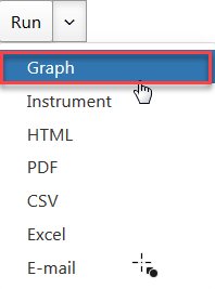
After the selections have been determined, hover over the “Run” icon and select “Graph”
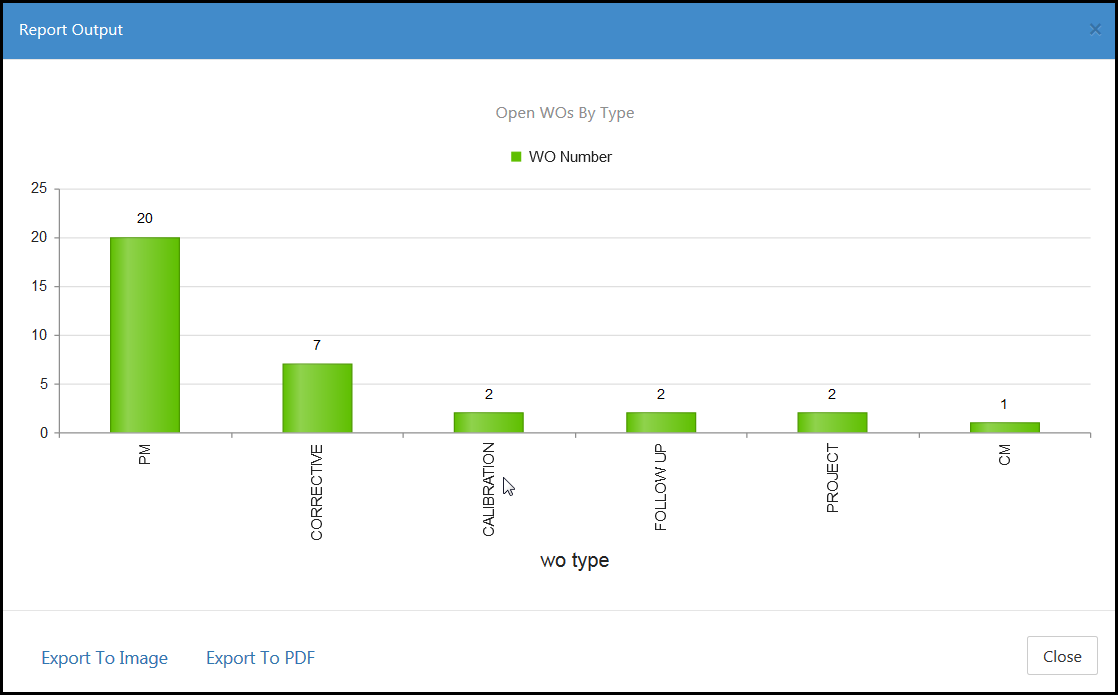
Finally, the Graph will print in the Report Output screen, which can be Exported as an Image or PDF.
CreatinganInstrument
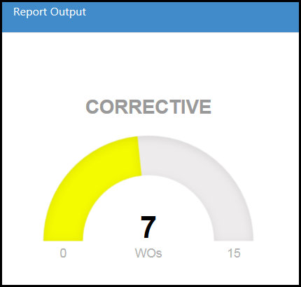
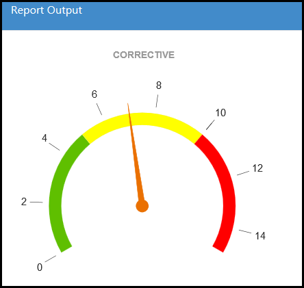
Instruments can be used to represent a high level perspective view of one particular data point, and designate ranges for that value indicating an acceptable total versus a total that may need to be managed more closely. For example, reporting on how many open corrective work orders currently exist in the system and determining how many is a manageable amount and how many is too many. A few requirements are also needed in successfully viewing a report as an instrument.
Include the Categories field as a selected field so that particular value can be viewed on the instrument
A function needs to be placed on a selected field by going to the properties and selecting the appropriate function. In the example below, we are counting the key field or unique value that will give us a count of all of the Open Corrective Work Orders (Work Order Number)
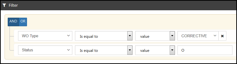
Filter appropriately as to narrow the search criteria to only return the value that should be seen on the instrument. In the example below, we want the Work Order Type to be “Corrective” only, and we also want the Status to be “Open”
Once these requirements are satisfied, the Instrument Properties can be selected.
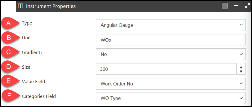
A - Type - Allows selection of the type of graph that will print. The options are Angular Gauge or Simple Gauge
B - Unit - Shows what the number returned on a simple gauge represents
C - Gradient? - Changes the color of the gauge to represent the range where that value falls. At least two ranges must be defined
D - Size - Controls the size of the instrument. A higher number will enlarge the gauge and a lower number will shrink the gauge. Please note that though this is set to 300 in the image above, this field defaults to 150.
E - Value Field - The field that was assigned a function under the Selected Columns section
F - Categories Field - The field that will show what the gauge represents by returning the appropriate value
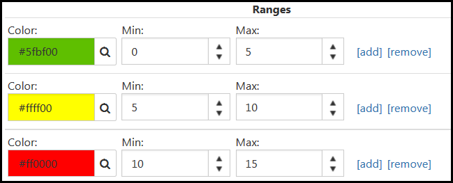
The ranges will determine how the instrument looks. This can serve as a visual representation of activity within the system. Clicking “Add” will enable the addition of another range of potential values, and clicking “Remove” will remove the range that was added.
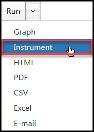
After the properties and ranges have been determined, hover over the “Run” icon and select “Instrument”
On an Angular gauge, all of the colors will display with all possible numerical values. A needle will point to the area that represents the value returned in the report.
On a Simple Gauge, we will see one numerical value and the color that represents the range in which the returned value falls.